


-
Navy and Mint Triangle Baby Quilt
When my best friend Hannah announced she was expecting a baby, I was just over the moon. I do look forward to having babies of my own in a few years, but being an aunt or pseudo-aunt is the ideal scenario: plenty of baby photos without the responsibility. (although not nearly enough baby cuddles… thanks, covid.)
Of course, I’m apparently a quilter now, so I wanted to make a quilt for the new baby. Hannah and her husband decided that they wanted to keep the gender a surprise until the baby was born. I started pulling fabrics that would fit their nursery colors of mint green with navy, but quickly realized how “gendered” my fabric stash is. I don’t think many baby boy quilts contain a bunch of floral prints.

So I said to Hannah, “I’m planning to make something for you (okay, not you, your baby), but I probably won’t get too far until A. COVID is gone enough that I can do some good fabric shopping or B. the baby is here so we know its gender.”
We laughed and said something like, “haha I sure hope the pandemic is over before the baby arrives!” Such naïveté. It felt like those many months would be plenty of time for this whole thing to get sorted out.


Suffice to say, Hannah’s baby girl arrived long before the pandemic was over. And my fabric stash was well equipped to make a quilt for a baby girl.
I played with stacks of fabric – this is my absolute favorite part of making a quilt. So many possibilities! And I always find treasures in my stash that I’ve forgotten about. I really wanted to somehow incorporate those chartreuse-esque fabrics on the top-right stack, but I had to remind myself that this quilt is for HANNAH, not for me. And I’m pretty sure Hannah would hate that chartreuse.
I did end up adding one pink floral fabric, but I tried to keep the girliness to a subtle minimum. Hannah’s color scheme already helped with that, but I hope that this quilt can grow with little baby A long after she’s not a little baby anymore.

To give the blocks contrast, I paired a light fabric (mint, white, cream, or pink) with a dark fabric (navy or gray) for each of my HST blocks, so each square has one light and one dark triangle. I sewed them using the “octo awesome method” which is an aptly named, truly awesome technique for sewing eight blocks at once from one big square!

Cut, trim, press. There’s so much tedium to a quilt but it’s also so relaxing and satisfying to work through the repetitive steps. And sewing a quilt for a baby is akin to a prayer. Whenever I didn’t have to think about what I was doing, my mind would wander to baby A… what will she be like as she grows? Will Hannah read to her on this quilt? Will the quilt make it to her big girl bed? In a year or two, will she notice or point out the bunnies and squirrels? It was so fun to send love to this little baby while sewing a tangible manifestation of that love.
Once the blocks were flat, it was time to work through layout.
Block layout is so hard for me. I always want it to be PERFECT, but it’s such an art. Small changes can make a really big difference. It’s also very tactile – the only way I can do it is to lay out as many blocks as I can on my table and move them around until I start to see something that I like. I also find it HUGELY helpful to take pictures as I go, because then I can easily swipe back and forth between pictures on my phone and see what I like better. The photos also help me see more of the big picture and I often notice patterns (good or bad) that I may not have seen otherwise.


These are some of the pictures I took as I worked through the layout for this quilt. It’s a little scary to share them because I’m worried Hannah will see them and think, “oh man I like that other one better!” But it’s so fun to see how incredibly different the quilt looks just by rearranging the blocks.
I played with a flying geese design, just like with Marie’s baby quilt. I love the way flying geese uses triangles and I think it can be really fun and modern. But it wasn’t quite right for these fabrics. I also played with a chevron but I’m worried that chevrons are too much of a current trend, and I wanted this quilt to be more timeless than trendy. Finally I got to pinwheels, and that felt just right. A timeless pattern, but still somewhat modern when sewn from these fabrics. I then mixed up the pinwheel blocks so each 8-triangle block has 2 sets of matching triangles (instead of the default 4-matching). It felt like the perfect blend of structure and randomness.

Taking phone pictures also really helps for putting all the blocks back where they belong in between steps!


Finally, my quilt top was complete! Time for the next challenge: choosing a quilt back. I found this fabric that I had bought in Jaipur last year, and it just felt perfect. Yes, it’s more girly than the front of the quilt, but it’s still not babyish. It also perfectly echoes the tiny flowers on the dusty pink blocks, which I love.

I quilted in straight diagonal lines, again, because if it ain’t broke, don’t fix it. I bound it with solid navy to keep it clean and crisp.
The finished quilt is 40 x 50″, which is pretty big for a baby quilt! Lots of room for baby to roll around and play on, and big enough that it’ll be useful in the future, too. Finished block size was 4 ⅞” per block, for 9 ⅞” per pinwheel foursome. For my reference: I cut my original “octo” squares to 12″. The quilt contains 20 pinwheels, 80 HST blocks, 160 triangles total.

Finally it was finished, and ready to meet baby A!


I took some photos before packing it up… but what good is a baby quilt post without some baby booty!?

And even better with butt ruffle pants. Hannah, you make excellent outfit choices. And thank you so much for taking these pictures… I’m sure you weren’t busy or anything.

This might be my last quilt for a little while, but they were the perfect immersive projects for 2020. I’m so grateful for my sewing room. And, of course, I’m a thousand times more grateful that these pandemic-born babies are so healthy and amazing. It’s a hard time to learn to be a mama and I am so proud of Hannah, Marie, Katie, and all the other new mamas out there.
-
Blue Scissors Print Sleeveless Button-Down Top
As I’m sure you can relate, my 2020 was a big year for “use what you have”. I hate clothes shopping anyway, so the fact that I haven’t cycled through any of my wardrobe items this year isn’t unusual for me, but my outfits lately have felt so stale.
Living in South Florida, I already end up with major outfit-planning fatigue because we essentially only have one season, so all my favorite clothes (oh, Fall clothes!) reside on the topmost closet shelf in perpetuity. Especially when I’m getting dressed for work, I am so sick of all my clothes – and more than ever after this year of nowhere to go and nothing to do.
But one day, this outfit boredom forced me to experiment and led me to a very small revelation (and right now the small things are 1000% worth celebrating). I donned a chambray sleeveless button down that had, up until that moment, been designated as “beach fun clothes only,” and added a cardigan for the chilly office and to cover my shoulders (here’s a peek of the shirt). For the first time in a year, I was wearing a new ensemble and it felt great. But what felt greatest was the sleeveless + sweater combo. I’ve always avoided button downs because by the end of the day, my shoulders and upper arms just feel restricted and worn out. Maybe I’m being overly sensitive or maybe it’s #yogaproblems. But suddenly I had the put-together look of a button down without the restrictiveness of SLEEEEVES. Gamechanger.

How a sleeveless shirt becomes office attire 
the quarantine hair is out of control! And we know what a revelation like that means for a garment sewist: Time to make more.
I traced the shirt – and tracing a sleeveless shirt is SO easy! I borrowed the placket dimensions from the Kalle shirt pattern, and also compared my collar trace to her collar piece to figure out best seam allowances. Then, in true use-what-you-have spirit, I cut it out of a piece of fabric from my stash that I had stolen from my mom’s stash: this fantastic scissor-print cotton circa 1992.
There was a lot of tweaking on this first round of the pattern. My trusty traced RTW chambray shirt had a tiny bit of stretch to it, whereas this fabric is a tight weave with no stretch at all, so the seam allowance went down to bare bones. I had to do a few rounds of dart placement and yoke line adjustments. The hem and the arm hole cuts are always so tough because they can make or break everything, but I kept trimming little by little and love how they both came out. The armholes don’t gape, which is a problem I often have with RTW sleeveless shirts, so I’m very excited about that.


I added a contrast inside yoke to this shirt just like I did on my Kalles, and pledged to never sew a non-contrast yoke (unless of course I ever make like, a plain white shirt). I mean, why not? It’s so fun and so special. And if you haven’t met the Burrito Method for sewing yokes, prepare to be amazed!
I finished the armholes and the hem with bias tape. There’s no easier way to deal with those tightly curved edges. Here are some close-ups… I’ve realized I LOVE when other sewing bloggers provide more detail shots so I’m trying to do this more often. It’s also a great chance to admire this scissors fabric, because it is just the best subtle-sewing-shoutout.


Button plackets are another thing I haven’t done in a while. It was tedious but not at all worth talking myself out of it – I’ve been avoiding button plackets for a long time!
I did accidentally sew – and cut – one too many buttonholes so I had to sew the last one closed. And guess what? Nobody will ever notice.
I’m looking forward to making another shirt with this pattern because I know round 2 will go so much faster.

Thanks to my cutie HUSBAND (!) for taking these pictures at my favorite pink wall!
-
Primary Color HST Baby Quilt
Back in the Before Times, February 2020, I went on a trip that included a stop in Japan, which for me meant a stop in Nippori Textile Town aka Fabric Heaven. My dear friend Marie was expecting a baby, and I wanted to make her a little something… then I found this sheep fabric and it was just PERFECT.

Marie loves knitting, and animals, so by association she loves sheep and alpacas – they’re both adorable AND they help make yarn. I loved these cute baby sheep, plus the fabric was gray – extra perfect since I didn’t know the baby’s gender yet.
By the time I started on the quilt, of course, we were in full stay-at-home, mask-up mode. A trip to Japan was as likely as a trip to Mars. I had just completed my rainbow quilt top, QUILTID-19, and in true quilter fashion, I decided to start another quilt top before actually quilting/finishing my first quilt. So I pulled fabrics from my stash to match the sheep accents: soft red, yellow, aqua, and gray; and started cutting.
After the 500+ triangles that went into QUILTID-19, I treated myself to simplicity this round and cut really big triangles, 10″ each, for a breezy 40 triangles total. The finished quilt came out to about 35 x 44″.


One of the hardest parts of quilting, for me, is laying out the blocks. I always have to play around with the layout and I never feel like it’s just right. Here on the left, you can see my “first draft”. I loved the rainbow gradient of QUILTID-19 so much that I considered trying that again, but it didn’t work AT ALL with these colors or the large blocks. I then pivoted toward a flying geese-based design. I chose the solid gray, red, and aqua as my dark contrast, and the yellow, light gray, and light red as my lights. I think this is a fun way to play with a classic quilt pattern: the large scale and the non matchy-matchy makes it more modern.
It was so refreshing to work with these large blocks and the quilt top came together so quickly!

Next it was time to quilt. I once again used my ill-advised method of basting with just straight pins. This quilt wasn’t too big, so it was much easier to wrestle through my home machine. I also didn’t need to use nearly this many pins!

I quilted with simple diagonal lines again. I like how the minimal quilting keeps quilts more lightweight and “scrunchable”. I also don’t trust myself to do intersecting quilting lines yet… I just know that will cause some puckers to get sewn down on the back of the quilt.

love those little sheepies! I didn’t want to add yet another print, so I bound the quilt in the same solid dark gray that I used for some of the blocks. This also helped to tie in the dark gray blocks, since that was the darkest color on the quilt top. The dark gray border gave it an anchor.

I always make my own quilt binding, and this one I cut on straight grain rather than the bias. Here’s how I bind my quilts. But I did the binding entirely by machine this time! No more hand sewing for me. I used this machine binding tutorial from APQS and intend to machine bind probably all of my future quilts. I also believe that machine binding will hold up better to regular machine washing.
As always, I find Clover wonder clips to be a godsend when it comes to binding.


Finally it was all done and ready to make the long journey to the UK!

Baby Benjamin and his cat friends – I’m not sure whether this is Luna or Tonks (fantastic names) – are big fans. The quilt has been part of tummy time and many a park outing and I’m so, so glad it’s being used and loved!
I also love that many of the fabrics have tiny animals on them (including more tiny sheep!). It’s so fun to think of Baby Ben becoming Toddler Ben and noticing the little zebras, sheep, and elephants on his quilt. Every baby quilt should have a little bit of I Spy to it, I think.
These are my go-to quilting items that I used on this (and every) project:
The Warm Company Warm And Natural Cotton Needled Batting 90″x96″ – this batting is so easy to work with! Natural and not too heavy.
Juki HZL-F600 – My trusty sewing machine. I finally upgraded a few years ago and this machine is just amazing. I wouldn’t have dared to machine quilt anything bigger than a placemat on my old machine.
Clover wonder clips – Perfect for pinching and holding layers together without pins.
-
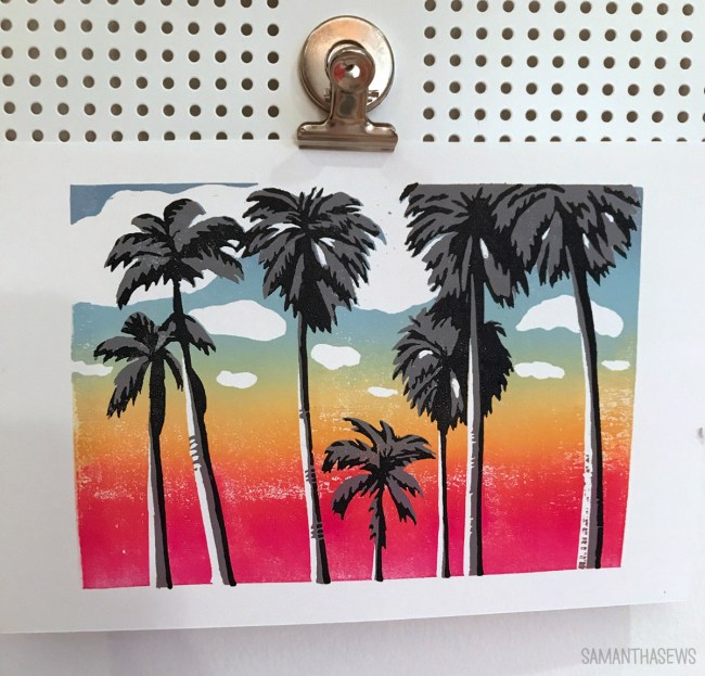
Reduction Block Printing: Rainbow Palm Trees
Over the past few weeks, I’ve been treating myself to what I’m calling Art Camp. Oolite Arts is a Miami Beach-based arts center, with artist residencies, art programs, and classes. Sadly, their classes have been shuttered for months now due to COVID-19 (have you heard about Florida…), but they’ve been offering virtual classes for free. No commute, no pressure, no cost… all that’s left is for me to invest the time.
Hence, Art Camp. Because it’s the weirdest summer ever, so at least I’m going to play with some paint.

I really love block printing so I was excited to join a class exploring reduction block printing, which is a technique I haven’t tried before, taught by Nick Mahshie. He’s the Oolite printmaking resident and a really fantastic teacher.
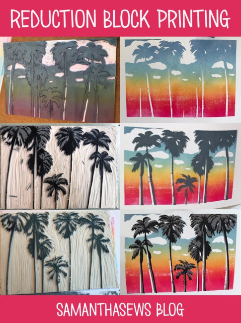
Reduction block printing produces a layered block print, but each layer comes from the same block – the block is cut away after printing each layer. It requires a LOT of advance planning, because each cut I make in the block impacts the entire future of the design. It’s intimidating because it’s a destructive process by nature. Now that I’ve finished my edition of prints, I can never make more of the exact same, because I’ve carved away and essentially destroyed the parts of the block used to make the first 2 colors of my 3-color print.

The three stages of my rainbow palm trees block print. The same block is used the whole time, but more material is carved away with each stage. 
For layer 1, I carved away only the whites: the clouds and the highlights along the palm trunks. I had to think of this as “areas where I don’t want ink to be, EVER.” There’s no putting material back once you’ve carved it away.

I had every intention of following the prompt for the class – we all worked from the same source image (a palm tree photo), but each drew our own block images. This process is complicated when attempting it for the first time, so I’m glad the class was structured this way and I was glad we were all on the same page. But when it came time to print, I deviated from the script completely, and abandoned blue sky in favor of this beachy sunset. Because sunset palm trees are the palm trees I know and love.
Printing the gradient was magical. I mixed up four colors: a red-ish magenta, orange, and two shades of blue; and prepped them on an inking plate. As you can see above, I ended up using two inking plates – this helped me get enough surface to really spread the ink properly on the brayer. With one-color prints, it’s easy enough to roll the brayer in all different directions to ensure the whole area is properly inked, but with the gradient it’s crucial to only roll the brayer in one direction. Having more “runway space” with the two inking plates really helped my ink consistency.

After printing this first block, I already loved where this design was going. Next it was time to cut away everything on the block that I wanted to remain “sky”, and this meant cutting the outlines of the palm trees.

I carved away the sky portions of my block, and printed the gray layer of the palm tree silhouettes.

Here, above, is the block from the gray layer. I took this picture after I printed the gray and was starting to carve for the black layer. Planning the outlines for the black layer was tricky, and I found it easiest to draw directly on the block where I wanted the black printed areas to be.

Here is the block for the black layer. Everything is carved away except the final darkest shadows. I had used a washable marker to draw the black shadows, so I washed that away before I started my prints.

The most important part of reduction block printing, or any multi-layer block print, is proper registration. It’s crucial to make sure each layer is aligned, so the overlapping shapes end up where they’re supposed to be. My registration board is just a piece of cardboard, with a rectangle cut to the exact size of the block, and lines drawn on the bottom and right-hand side to align the edges of the paper for each print. I also cut myself a thumb hole to make it easier to remove the block out of the registration jig for each inking.
I also drew a little pencil palm tree on the side to make sure I always placed the block in right-side up! Don’t want any upside-down palm trees.

I made an edition of 12 prints total. I wanted a safe margin because there’s risk of messing up prints at every stage, and, again, there’s no going back and reprinting a previous stage because that block no longer exists. I have a few that didn’t register perfectly – the black and gray layers aren’t quite lined up – but that’s part of the nature of block printing and those prints still have charm. There are also a few where the rainbow gradient is a little blotchy because it was REALLY tough to maintain consistent inking across all the colors. But even that – it’s sky, so as the artist I say that a little bit of blotchiness still… looks like sky!
I was really glad to be working with organic shapes for the first relatively detailed block I’ve carved. The block material is soft, like an eraser, and especially on the final black layer, some of my small details and thin lines just crumbled or peeled away. And this isn’t a big deal, because they’re palm trees! They’re not perfectly uniform anyway. But if I had been trying to carve something like a building, or a design I had been considering – a lifeguard stand – the wiggly lines would become more of an issue. So I may look into different materials in the future if I want to make more precise blocks.
The whole printing process is so satisfying. I love the meditative process of carving, it’s a very “flow” activity for me. I love the methodical work of rolling out the ink for each print, and the sigh of relief when peeling back each successfully printed sheet.
But the best part is the progression. Each stage looked so good. I loved my rainbow sky gradient. It got even better with the gray silhouettes. But that final black detail layer really makes it all pop. Each layer almost felt like it could stand alone, but the final layer comes along and proves them wrong. “This is what you needed,” it says.

I’m taking more classes with Oolite and I highly recommend them! Since they’re virtual, you don’t have to be local. Art Camp for everyone!
I got a lot of questions as I was sharing these prints on Instagram and I hope my explanation of the process is enlightening. It’s such a neat method and I’m really glad I had the chance to try it.
Here’s a sped-up video of me printing the rainbow gradient.
Here’s another outline of the reduction method that really helped everything click for me: Reduction Linocut Method by Natalia Moroz. Such a gorgeous print, too!
And some Pinnables:
-
Sam Learns to Paint: Introduction
Painting is something I’ve always wanted to be better at, but it’s also something with a relatively steep learning curve, especially because in order to paint… one must draw. And drawing is something I’ve always been challenged by. In 2018, I decided it was time to learn to draw, and the only way to learn was through repetitive practice. I chose “draw and play” as my challenge for The 100 Day Project, and recorded my progress on Instagram with the hashtag #100daysofdrawandplay.
Throughout the project, I was amazed at how hard it was to just start. I was entirely convinced that I couldn’t draw, and possibly would never be able to draw. But every day for 80-something days (yes… I fell off the wagon before I made it to day 100…), I sat down and tried. It was so hard. My brain was constantly nagging me, saying, “you’re not any good at this,” and every few seconds as I drew I’d have to think back, “shut up brain, this is something new, I’m learning and trying.”
There were a lot of drawings that I just hated. I could see in my head what I wanted the drawing to look like, but it just didn’t make it to the paper. It was – and is – so frustrating.
But – and this principle is the heart of The 100 Day Project – it’s very hard, maybe impossible, to do something for 100 days in a row without improving. I prefer the German phrase that aligns to “practice makes perfect”: Übung macht den Meister. Literally, practice makes the master. Let’s ignore perfection and focus on the fact that practice begets improvement, and continued practice is the only true path to mastery.
Highlights from 100 Days of Draw and Play (@samanthasews) My 85 paintings taught me many things, especially just how much there was to learn. I learned new ways to squint my eyes, new ways to hold my brushes. The amount of water my paper could handle; the amount of water each brush could hold. I learned that painting realistically is all about finding the light and the shadows and forgetting, entirely, what an object is shaped like and merely focusing on how the light is touching the object at that moment.
Learning Days from 100 Days of Draw and Play (@samanthasews) Here is another assortment of paintings. If the first grid was the highlights… this grid must be the “lowlights”. I made these during the same 3-month period, all part of the same project. So there was credence to my brain’s arguments: some of my drawings were terrible! Some days I didn’t have the patience to really dive into a painting; some days I tried to paint something that was beyond my skill level; some days I thought I was on the right track, only to finish a painting and think, “ugh.” I like to think that even on these days where I made “art” that I cringe to look at, I was still learning something. And above all else, I was building the habit of trying.
85 days of concerted effort were enough to convince my brain that maybe I can draw. Most importantly, the project convinced me that the time spent drawing wasn’t a waste, because the practice led to real improvement.
I’m sharing all this now because I want to keep trying. I still want to get better at drawing and painting, and it’s still really hard to take the time to practice and to find the strength to push through the creative walls in my brain that say, “this painting is terrible, stop painting and scroll Instagram instead” (and then, while scrolling, say “look how much better everyone else can paint”). Writing this is a reminder to myself that learning new things is hard, scary, and worth it. So I’m going to keep painting. Because what do I have to lose?


