-
A Watercolor Car Portrait for David
In 2018, I decided to teach myself to draw and paint. I practiced drawing every day as part of the 100 day project and shared the posts on Instagram as #100daysofdrawandplay. One of my proudest paintings came toward the end of the project (of course), when I felt that I was ready to tackle something big: a portrait of my first car (whose name was Car).
I framed my car painting, and it’s currently on the wall of our entryway, next to where we keep our keys. I love having it there. It’s in a simple, square white frame, and I’ve always thought it would be fun to expand the collection. I had the idea to paint David’s car for him ages ago, but it wasn’t until his birthday month arrived that I decided to finally go for it.

almost done… can you find what’s missing? 
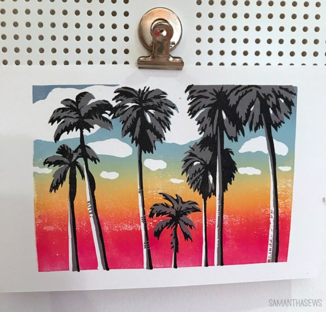
I mean, can you blame him? Meet Scoot. Formally known as a Fiat 124 Spider Abarth, Scoot is David’s Miami-mobile. When we finalized our plans to move to the land of palm trees and sunshine, David decided that his Florida lifestyle couldn’t be confined by things like “roofs”. A few years without winter mean this is the ideal time to own a convertible, and David loves this car. He drives with the roof down every trip, settling for coverage only during hurricane downpours or traffic jams in summer sun. So I knew he’d love an homage to Scoot.
When I made my first car portrait, I learned that painting a car is challenging in many ways. The body lines, shadows, highlights, reflections – cars are such an inorganic object and so purposefully designed that tiny flaws in the drawing or painting are extremely noticeable. The slightest difference in angle can make the car look wonky, and something just looks “off”. My 2018 drawing of Car took HOURS, but that was all part of the exercise – I was training my brain to draw and, more importantly, to see. I’m really proud of that drawing because I remember how challenging it was. But this time, I was just making a painting, not giving my brain a workout.
So I cheated. I printed a photo of the car, and transferred the outlines of the image by covering the back of the printout with graphite, then tracing the car on the front side. This saved me a lot of time and a lot of error, but honestly? It wasn’t cheating at all. There was still so much “artistic work” involved to make this painting, especially fine tuning all the various shadows and subtle color shifts, and I know that tracing made me no less of an artist. I started this habit with the wedding watercolor for my brother and sister-in-law, and it’s a trick I expect I’ll continue to use.
The painting took many focused hours, stretched over about a week. It’s hard to hide a watercolor because you don’t want to disturb it while it’s wet! But I managed to keep the secret safe.

I put the painting in a white, square frame to match my original painting of Car, and gave it to David for his birthday. It was actually David’s idea to add the black mat and it is the perfect artistic touch.

I was not the only one who thought to give David a car-related present… it was fun that both his parents and his (new!) in-laws gifted him car themed items as well!

I added a matching mat to my existing portrait, and now they make a lovely pair that will soon be hanging together in the entryway. It’s also fun for me to see how my skills have developed. I still love my first car painting, but it’s clear that I’ve become a better painter and artist in the three years since then. It’s hard to remember, but so much of this skill is just about practice.
-
Reduction Block Printing: Rainbow Palm Trees
Over the past few weeks, I’ve been treating myself to what I’m calling Art Camp. Oolite Arts is a Miami Beach-based arts center, with artist residencies, art programs, and classes. Sadly, their classes have been shuttered for months now due to COVID-19 (have you heard about Florida…), but they’ve been offering virtual classes for free. No commute, no pressure, no cost… all that’s left is for me to invest the time.
Hence, Art Camp. Because it’s the weirdest summer ever, so at least I’m going to play with some paint.

I really love block printing so I was excited to join a class exploring reduction block printing, which is a technique I haven’t tried before, taught by Nick Mahshie. He’s the Oolite printmaking resident and a really fantastic teacher.
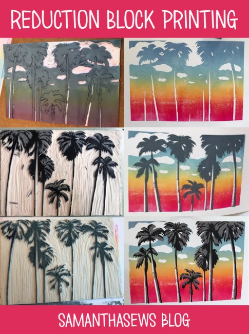
Reduction block printing produces a layered block print, but each layer comes from the same block – the block is cut away after printing each layer. It requires a LOT of advance planning, because each cut I make in the block impacts the entire future of the design. It’s intimidating because it’s a destructive process by nature. Now that I’ve finished my edition of prints, I can never make more of the exact same, because I’ve carved away and essentially destroyed the parts of the block used to make the first 2 colors of my 3-color print.

The three stages of my rainbow palm trees block print. The same block is used the whole time, but more material is carved away with each stage. 
For layer 1, I carved away only the whites: the clouds and the highlights along the palm trunks. I had to think of this as “areas where I don’t want ink to be, EVER.” There’s no putting material back once you’ve carved it away.

I had every intention of following the prompt for the class – we all worked from the same source image (a palm tree photo), but each drew our own block images. This process is complicated when attempting it for the first time, so I’m glad the class was structured this way and I was glad we were all on the same page. But when it came time to print, I deviated from the script completely, and abandoned blue sky in favor of this beachy sunset. Because sunset palm trees are the palm trees I know and love.
Printing the gradient was magical. I mixed up four colors: a red-ish magenta, orange, and two shades of blue; and prepped them on an inking plate. As you can see above, I ended up using two inking plates – this helped me get enough surface to really spread the ink properly on the brayer. With one-color prints, it’s easy enough to roll the brayer in all different directions to ensure the whole area is properly inked, but with the gradient it’s crucial to only roll the brayer in one direction. Having more “runway space” with the two inking plates really helped my ink consistency.

After printing this first block, I already loved where this design was going. Next it was time to cut away everything on the block that I wanted to remain “sky”, and this meant cutting the outlines of the palm trees.

I carved away the sky portions of my block, and printed the gray layer of the palm tree silhouettes.

Here, above, is the block from the gray layer. I took this picture after I printed the gray and was starting to carve for the black layer. Planning the outlines for the black layer was tricky, and I found it easiest to draw directly on the block where I wanted the black printed areas to be.

Here is the block for the black layer. Everything is carved away except the final darkest shadows. I had used a washable marker to draw the black shadows, so I washed that away before I started my prints.

The most important part of reduction block printing, or any multi-layer block print, is proper registration. It’s crucial to make sure each layer is aligned, so the overlapping shapes end up where they’re supposed to be. My registration board is just a piece of cardboard, with a rectangle cut to the exact size of the block, and lines drawn on the bottom and right-hand side to align the edges of the paper for each print. I also cut myself a thumb hole to make it easier to remove the block out of the registration jig for each inking.
I also drew a little pencil palm tree on the side to make sure I always placed the block in right-side up! Don’t want any upside-down palm trees.

I made an edition of 12 prints total. I wanted a safe margin because there’s risk of messing up prints at every stage, and, again, there’s no going back and reprinting a previous stage because that block no longer exists. I have a few that didn’t register perfectly – the black and gray layers aren’t quite lined up – but that’s part of the nature of block printing and those prints still have charm. There are also a few where the rainbow gradient is a little blotchy because it was REALLY tough to maintain consistent inking across all the colors. But even that – it’s sky, so as the artist I say that a little bit of blotchiness still… looks like sky!
I was really glad to be working with organic shapes for the first relatively detailed block I’ve carved. The block material is soft, like an eraser, and especially on the final black layer, some of my small details and thin lines just crumbled or peeled away. And this isn’t a big deal, because they’re palm trees! They’re not perfectly uniform anyway. But if I had been trying to carve something like a building, or a design I had been considering – a lifeguard stand – the wiggly lines would become more of an issue. So I may look into different materials in the future if I want to make more precise blocks.
The whole printing process is so satisfying. I love the meditative process of carving, it’s a very “flow” activity for me. I love the methodical work of rolling out the ink for each print, and the sigh of relief when peeling back each successfully printed sheet.
But the best part is the progression. Each stage looked so good. I loved my rainbow sky gradient. It got even better with the gray silhouettes. But that final black detail layer really makes it all pop. Each layer almost felt like it could stand alone, but the final layer comes along and proves them wrong. “This is what you needed,” it says.

I’m taking more classes with Oolite and I highly recommend them! Since they’re virtual, you don’t have to be local. Art Camp for everyone!
I got a lot of questions as I was sharing these prints on Instagram and I hope my explanation of the process is enlightening. It’s such a neat method and I’m really glad I had the chance to try it.
Here’s a sped-up video of me printing the rainbow gradient.
Here’s another outline of the reduction method that really helped everything click for me: Reduction Linocut Method by Natalia Moroz. Such a gorgeous print, too!
And some Pinnables:
-
A Christmas Painting for the Newlyweds
My little brother (okay, little by just 18 months) got married in June and it was just so great. I finally have a sister (in law) and it was so exciting to be a part of their special day and the months leading up to it. I wanted to do something special for them for Christmas, and decided to test my painting skills.
They did a sparkler sendoff and the photographer captured this completely magical photo of them kissing at the end of the night, surrounded by light and love. It was already such an artsy, interesting photo, that I thought it would be fantastic rendered in watercolor.
Of course, the hardest part about painting (for me) is setting up the drawing… so I cheated. I downloaded the photo, posterized it in Photoshop, then laid it against the window and traced the major outlines. Then I flipped it over and rubbed the image to transfer my pencil lines to the paper.
This was far more technical and less creative than drawing the image by eye… but it also meant they were still shaped like real people. So I am really glad I did it this way.

Then I got to fill in with watercolor, starting with major shadows. The blending and the shading on such a dynamic image was really fun.
The thing I was most worried about was mixing a realistic skin tone. That, and shadowing/defining the hands… I feel like those are two things that can so easily turn out completely wrong. But I think I managed okay, and didn’t accidentally turn them too orange or too pink, or peach colored crayola crayon like back in kindergarten. Basically, I was scared they’d end up looking scary, and that didn’t happen!

I stylized the sparklers and removed the bystanders in the name of art. I tried to make it feel magical, like shooting stars wishing them well on their new life together.

Finally, a black frame and a clean white mat elevated it and added that extra bit of contrast.
It was such a fun project and a joy to give.


